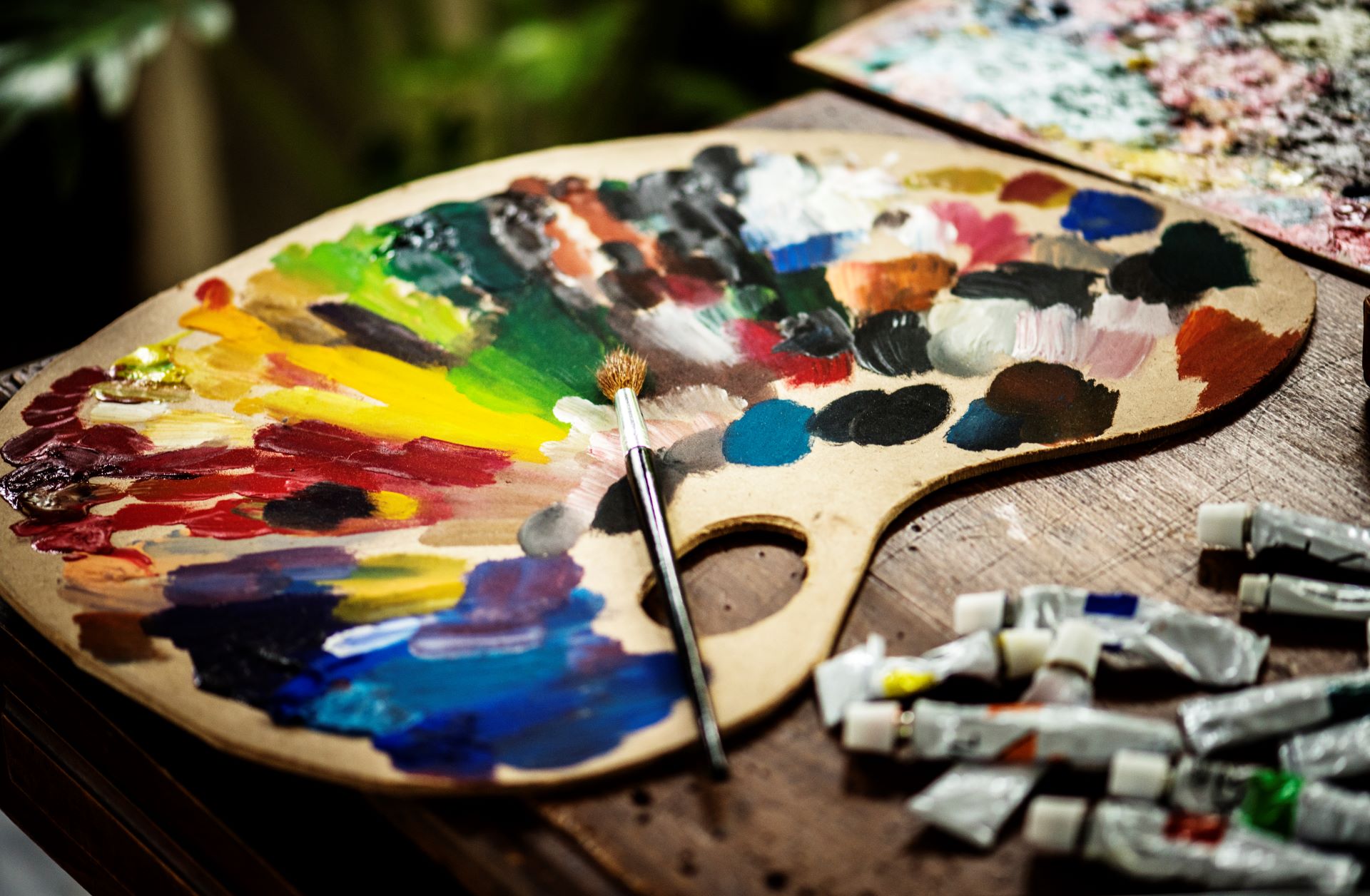
Every year, the leading paint brands and color experts announce their picks for the color of the year, a hue that reflects the mood, trends, and inspiration of the time. For 2024, the colors of the year are diverse and vibrant, ranging from earthy terracotta to soothing blue to cozy olive green. These colors can add some personality, style, and freshness to your home, whether you use them as accents or as main themes. It is always best to explore how to apply the 2024 color of the year to your home, and how it can represent the vibe of your space.
Persimmon by HGTV Home by Sherwin-Williams
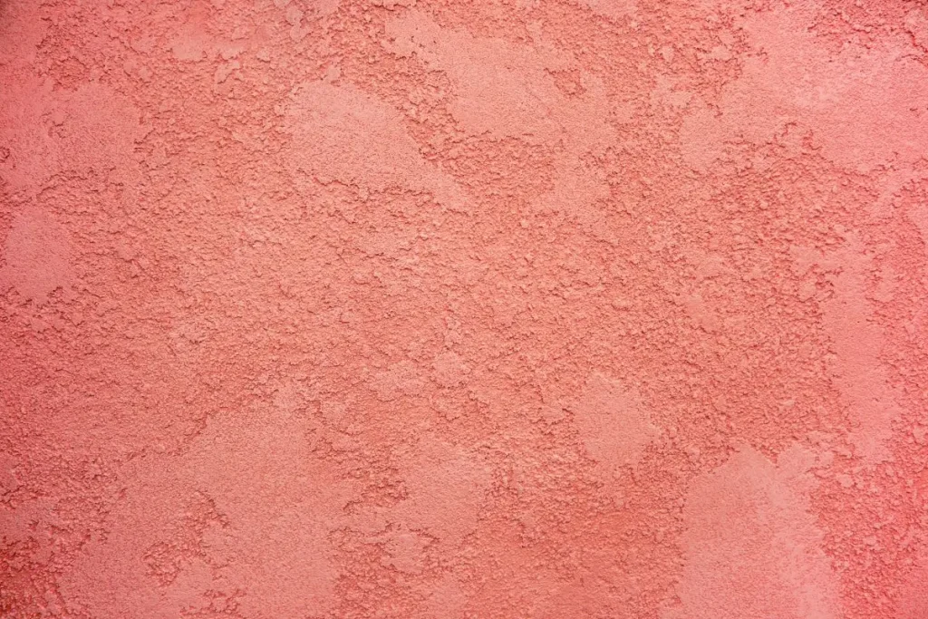
Persimmon is the color of the year by HGTV Home by Sherwin-Williams, a warm and cheerful terracotta shade that balances the energy of tangerine with grounded neutral undertones. Persimmon is part of the Renewed Comfort color collection, which features gentle and restorative hues that create a calm and cozy atmosphere. Persimmon is perfect for spaces like living rooms and kitchens, as it promotes positive relationships and conversation. The beautiful shade helps rejuvenate a space while bringing unique design visions to life.
To use Persimmon in your home, you can:
- Paint an accent wall or a fireplace mantel with Persimmon to create a focal point and a pop of color.
- Use Persimmon as a backdrop for your artwork, photos, or shelves, to make them stand out and add some contrast.
- Mix Persimmon with other colors from the Renewed Comfort collection, such as soft grays, creams, and blues, to create a harmonious and soothing palette.
- Accessorize your furniture, pillows, rugs, or curtains with Persimmon, to add some warmth and texture to your space.
Cracked Pepper by Behr
Cracked Pepper is the color of the year by Behr, a soft black color that is sophisticated and versatile. Cracked Pepper is a neutral, timeless, and modern shade that awakens the senses and exudes confidence. Behr chose Cracked Pepper after conducting research that showed more than half of Americans believe darker colors give a room a designer aesthetic, and help create a bold and fresh new look.

To use Cracked Pepper in your home, try to:
- Paint your cabinets, doors, or trim with Cracked Pepper, to create a sleek and elegant look.
- Use Cracked Pepper as a base for your walls, and pair it with bright or pastel colors, to create a striking and playful contrast.
- Incorporate Cracked Pepper into your furniture, lighting, or hardware, to add some drama and sophistication to your space.
- Balance Cracked Pepper with soft cream linens and gold metallic accents, to create a cozy and luxurious feel.
Renew Blue by Valspar
Renew Blue is the color of the year by Valspar, a refreshing light blue with a vintage feel. Renew Blue is a nourishing, green-influenced blue that creates a sense of peace wherever you place it. Valspar says that Renew Blue is a simple and versatile color that can work with any style, from traditional to contemporary. Renew Blue is also a color that can evoke nostalgia and optimism, as it reminds us of the sky, the sea, and the past.
To use Renew Blue in your home, you can:
- Paint your ceiling with Renew Blue, to create a sense of openness and serenity.
- Use Renew Blue in your bathroom, bedroom, or nursery, to create a relaxing and soothing environment.
- Mix Renew Blue with dusty pinks, warm creams, and light wood tones, to create a classic, beachy aesthetic.
- Accessorize your space with Renew Blue, such as vases, pillows, or artwork, to add some freshness and personality.
Ironside by Dutch Boy

Ironside is the color of the year by Dutch Boy, a nature-inspired olive green color that is great for anyone who seeks to make their home a sanctuary for well-being. Ironside is rooted in comfort and creates a space that is elegant and charming. As dark shades become more appreciated in the home, this deep olive is versatile in wide-open spaces or enclosed comfy places, reflecting well-being from all angles. Ironside is also a color that can connect us with nature and bring some organic and earthy vibes to our space.
To use Ironside in your home, try to:
- Paint your walls with Ironside, to create a cozy and inviting atmosphere.
- Use Ironside as a contrast for your white or light-colored furniture, to create a modern and sophisticated look.
- Incorporate Ironside into your plants, fabrics, or ceramics, to add some texture and warmth to your space.
- Balance Ironside with metallic accents, such as copper, brass, or silver, to add some shine and elegance.
Tips on How to Blend Accents in Every Corner of the Room
Choose a color scheme
One of the easiest ways to blend accents in every corner of the room is to choose a color scheme that ties everything together. You can use a color wheel to find complementary, analogous, or triadic colors that work well with each other. You can also use a neutral color as a base, and add pops of color as accents. You can also use different shades, tones, or tints of the same color to create a monochromatic look.
Mix and match patterns and textures
Another way to blend accents in every corner of the room is to mix and match different patterns and textures that add some contrast and variety to your space. You can use stripes, polka dots, florals, geometrics, or animal prints as patterns, and use fabrics, metals, woods, ceramics, or plants as textures. However, you should avoid using too many or too clashing patterns and textures, as they can make your space look chaotic and busy. Try to also balance them with some solid colors and simple shapes, to create some harmony and order.
Use a focal point
A focal point is a feature that draws attention and sets the tone for the rest of the room. It can be a fireplace, a window, a painting, a mirror, or a piece of furniture. You can use a focal point to blend accents in every corner of the room, by using it as a reference or a guide. You can also use similar colors, shapes, or styles as your focal point, to create a consistent and unified look. You can also use contrasting or complementary colors, shapes, or styles as your focal point, to create a dynamic and interesting look.
Use symmetry and asymmetry
Symmetry and asymmetry are two ways of arranging your accents in every corner of the room. Symmetry means that both sides of the room are balanced and equal, while asymmetry means that both sides of the room are different and varied. You can use symmetry to blend accents in every corner of the room, by using the same or similar accents on both sides of the room, such as lamps, pillows, or plants. You can also use asymmetry to blend accents in every corner of the room, by using different or varied accents on both sides of the room, such as books, candles, or sculptures.
Use the rule of three
The rule of three is a design principle that states that things that are arranged in groups of three are more appealing, memorable, and effective than other numbers of things. You can use the rule of three to blend accents in every corner of the room, by using three accents that have something in common, such as color, shape, or style. You can also use three accents that have something different, such as size, height, or orientation. You can also use odd numbers of accents, such as five or seven, to create a similar effect.
The 2024 color of the year is a reflection of the mood, trends, and inspiration of the time. These colors can help you transform your home, and express your personality, style, and vibe. Whether you use them as accents or as main themes, these colors can add some fun, freshness, and flair to your space. Happy painting!