Oftentimes people seem to have a dilemma or struggle in which they should color their dream house. Focusing or knowing the process of choosing a theme or the right color palette choices as well as the finishing touches to your interior design by creating a well-thought-out house color palette scheme will surely save you money, time, and blueprint for future designs in your future home.
In order to create a House Color Palette, a person should consider a lot of factors and key color principles in order to make it work. Along with paint colors, a whole house color palette includes accent colors that guide you while choosing the decor and finishes for things like wood furniture, floors, stone, and metal. Overall, it acts as a complete blueprint for making decorating decisions.
Why Choose a Whole House Color Palette Ahead of Time?
It acts as a go-to guide for choosing any furniture or decor for your home, which eliminates some of the guesswork and helps streamline your decision-making as well. You can really save time and money when planning and choosing the color palette of choice ahead of time. It also lessens your stress level when you initially plotted what colors to pick and what to do with the design.
Set Your Intentions
It’s difficult to start anything without a concrete plan or road map on things you want to implement or set for your color palette designs. Brainstorming and determining the mood, tone, or atmosphere of the interior design can go a long way. Taking into account the suggestion or interests of your family members, kids, guests, and especially yourself are crucial key points in setting your intentions for your house color palette.
It would be best to ask yourself about your take or opinion regarding the current color palette set up at home. The most common questions to ask yourself are “Is it too dark?”, “Is it too bright?”, “Does it feel dirty?”. “Maybe they won’t blend or fit together”. After determining the things that you don’t like. Ask yourself what are the moods you like or look after. Some things to look out for when looking for moods are “calm and relaxing”, “Warm and welcoming”, and “Neutral but with a fun pop of color”.
Next, you have to figure out what type of colors it will take to create your ideal Whole House Color Palette. Color psychology is fairly complex and largely subjective, so we are not going to go into the topic. It’s best to have a basic understanding of Color Theory and Color Relationships in order to choose the best colors to fit the mood you’re going for.
Understand Color Theory Basics
The color wheel above can do many things, but it’s essentially a tool that helps us by providing a visual representation of colors that will work together. It can help you determine the degree of the hue which can be differentiated with a tint which is a combination of the hue color with an added touch of white, tone which is a combination of the hue color with an added touch of gray, and lastly, shade wish is a combination of the hue color with an added touch of black.
One thing that the color wheel highlights are Color Temperatures, which also touch a bit on mood. Warm Colors: Hues red through yellow, which includes most browns, beiges, and tans. Active and stimulating. Cool Colors: Hues green through purple, including most grays. Recede or fade. Cool and Relaxing.
Color Schemes/Relationships
1. MONOCHROMATIC COLOR SCHEME
One color from the color wheel is repeated in various shades and tints. You can have just one paint color repeated through your home in different shades.
2. COMPLEMENTARY COLOR SCHEME
Opposites on the color wheel. It’s best in complementary color schemes to use the undertones in neutrals to create a complementary color scheme and to allow one of the two colors to be the more dominant. They are a perfect balance maximizing contrast and stability.
3. ANALOGOUS COLOR SCHEME
Three colors are beside one another on the color wheel. In interior colors, a good rule is to consider 60-30-10. When using neutrals, this is very close to a monochromatic color scheme.
4. COMPOUND COLOR SCHEME (SPLIT-COMPLEMENTARY)
A combination of complementary and analogous color schemes. It takes opposite colors, but then it also gives you two additional colors that are right beside the main color. This color scheme is at it’s best when you use your base color as the dominant. Instead of choosing a full hue, try to focus on a color for your base that is more on the neutral side. Then, if you choose, you can go bolder with your other two shades.
5. TRIADIC COLOR SCHEME
This color scheme utilizes three colors that are evenly spaced around the color wheel as every fourth color. It’s recommended when using a triadic color scheme that you choose one color to dominate, then use the other two more sparingly to complement the main color. In interiors, this is a very bold choice as the colors will be high contrast.
Here are some of the color schemes and theories that you should consider in creating your own house color palette. Applying color theory can be overwhelming for some but choose what best peaks your interest. For example, if your favorite color is blue or red then focus on those colors first then try to correlate or contrast different color schemes that would best capture the mood or palette you would like to use in your own home.
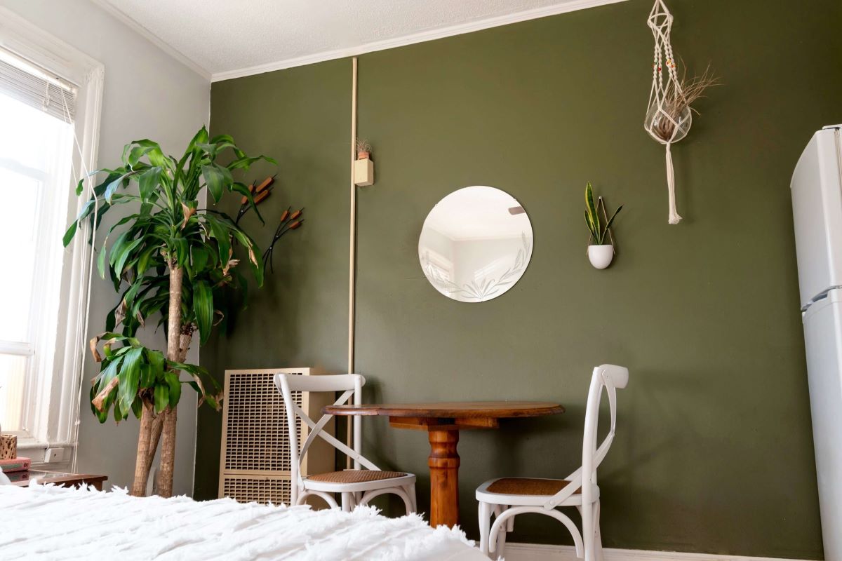
Consider if you have Fixed Finishes
Some examples of fixed finishers are wooden floors, cabinets, and other big pieces of furniture that will surely be beneficial in setting up the tone or mood of your house. Considering how things will complement each other will surely be worth the investment in the long run. Determining if the furniture will fit or complement the color scheme you will use is something that will help boost the overall elegance of your home. So it’s best to choose according to your color scheme.
If you’re working with neutrals, you’ll want to look for the undertone of the color to determine where it fits into a Color Relationship. A quick strategy for this is to look at the paint chip and see whether the undertone of the color becomes obvious in the darker shades.
Additionally, you can run the neutral color around the color wheel. An undertone will become more obvious in comparison to both the pure hue of that color or the complementary counterpart to that color. It’s pretty fun to test out.
Find Inspiration
Choosing objects of interest such as trinkets or antiques can really help you capitalize and complement those objects to your house. If you fancy marble type of architecture and designs, then there would be a color scheme that would best fit your house. If you fancy European house designs such as Swedish or Danish designs. It can help you brainstorm and get to a final decision relatively faster as you have a basis for what your want. You may also like contemporary or Italian type of designs in which Vista Land currently prides itself with. If those don’t work for you but you fancy modern glass box type of designs and buildings then it will help you get your ideal mood and atmosphere immediately.
Test Your Lighting with Large Color Swatches
Lighting and how it impacts paint colors is another complex topic. There are many factors, such as determining which direction the room faces and how colors respond accordingly.
However, what you mostly need to know is how the colors you’ve chosen as inspiration respond to the light. We recommend painting a large poster board with a sample of your color and living with it for a while. Observe how it responds to different times of day, different weather, and natural vs. artificial light. Overall, determine how it works with the finishes of the room in those situations. Adjust based on what you do and don’t like.
Choose Your Whole House Color Palette
A. MAIN COLORS
Out of the 3-5 Main Colors, at least one should be neutral, one should be a white, and one should be a darker contrasting color. For the remaining two, it’s up to you! Our personal preference is to stick with neutrals for my main colors and go bolder with my accent colors.
B. ACCENT COLORS
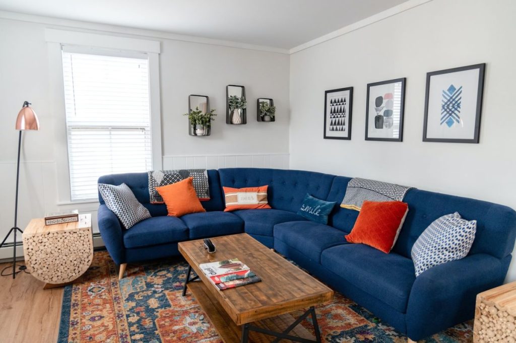
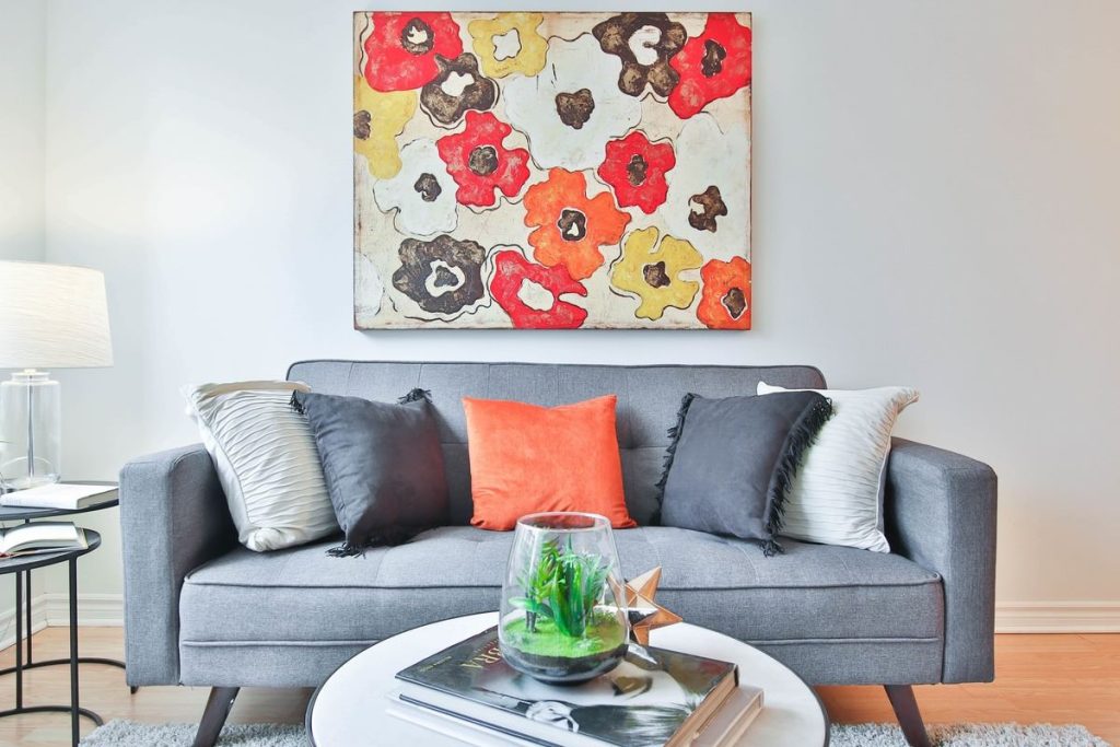
These are the colors that you will use throughout your home in your more changeable finishes such as throw pillows and other smaller accessories. You will usually use up to two of these accent colors in a single room, three would be the absolute maximum.
C. WOOD FINISHES
One or more of these may have already been determined by your fixed finishes. You will want to choose one or two more, depending on whether you have bought all of the furniture you plan to.
D. STONE FINISHES
These may be countertops, tile floors, or a brick fireplace. Again, these may have already been determined by your fixed finishes.
E. METAL FINISHES
Like any other finish in your home, metals have undertones. Gold, Brass, Bronze, and Brushed Nickel are warmer. Chrome and silver are cool. Black is neutral. You will want to use 1 or 2 in a single room of contrasting undertones.
Put it Into Action!
Now you are finally done with conceptualizing and narrowing down what you want in the interior and exterior color of your house as well as the furniture and fixtures along with it. It would be best to buy the best material and supplies from well-known and credible suppliers and brands in order to fully maximize your budget and bring out the best in your ideal home.
Hermosa
A sprawling and verdantly landscaped condominium village complemented by resort-inspired amenities that give a refreshing ambiance to modern city living.

Hermosa is a 2.9-hectare modern and exclusive resort-inspired condominium village rising in the vicinity of the upcoming 100-hectare integrated and master-planned Vista Global South township development rising along C-5 Extension in Las Piñas City, just 15 minutes away to NAIA and The Bay Area.
Related Blog: Style Your Home With Color Patterns