Pantone’s Color of the Year announcement is a yearly declaration that goes beyond simple design selections to represent current cultural influences and trends symbolically. Every choice is the outcome of a meticulous procedure that draws inspiration from a wide range of sources, such as changes in society, fashion, art, and design.
The selected hue turns into a powerful trend-setter that traverses multiple markets and influences everything from fashion shows and product designs to home décor and even the choice of colors for a house and lot. Pantone’s Color of the Year conveys to feelings that are felt all over the world and provides a visual representation of the goals of a diverse and connected world.
The announcement is much awaited by designers and creatives because it offers a creative center, promoting creativity and pushing boundaries in their respective industries. Beyond mere aesthetics, the Color of the Year has deep symbolic meaning that reflects the global outlook and sheds light on the state of the world today. Pantone’s Color of the Year essentially continues to influence the visual landscape of the world, becoming embedded in the fabric of artistic expression and allowing a lasting imprint on the cultural weaving.
What is the 2024 Pantone color of the year?
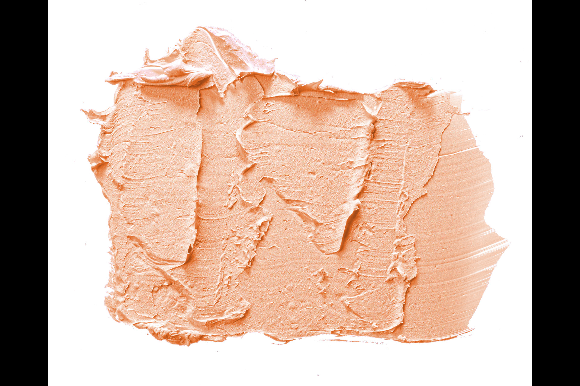
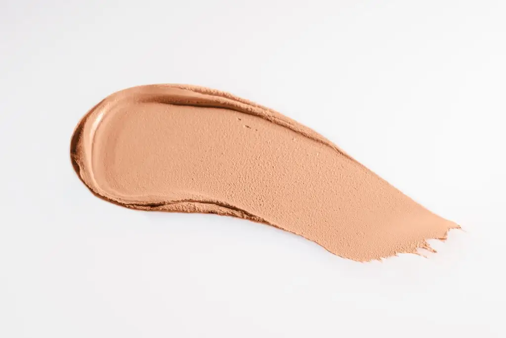
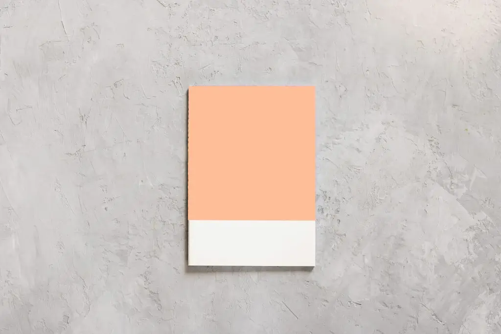
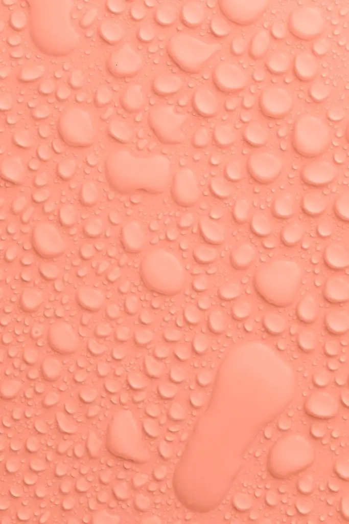
2024 welcomes the soothing and uplifting hue of “Peach Fuzz” as the Pantone Color of the Year 2024. Embracing the delicate essence of peach, this soft and warm shade symbolizes a collective yearning for comfort, tranquility, and optimism in the face of contemporary challenges. The selection echoes everyone’s need for comfort and connection and shows a desire for gentleness and a return to simplicity.
The color embodies a harmonious fusion of modernity and nostalgia, offering a versatile canvas for creativity in design and fashion. Whether adorning interior spaces or gracing fashion runways, this color exudes a sense of calm sophistication, encouraging individuals to embrace the subtle beauty found in life’s gentle nuances.
Peach Fuzz falls within the pastel spectrum and is characterized by a subtle blend of pale orange, pink, and beige tones. The exact shade can vary, and it’s often subjective, but it’s commonly associated with a light and gentle color that evokes a sense of warmth and softness. If you’re looking for a similar color, you might explore variations of light peach, pastel orange, or soft coral on color palettes to find a hue that aligns with the idea of “peach fuzz.”
Who is Pantone®?
Pantone is a well-known company for its color matching system, which is used to guarantee accurate and consistent color reproduction in a range of industries. By allowing different manufacturers and designers to refer to the same color values, the Pantone Color Matching System (PMS) ensures consistency across a range of materials and products.
Pantone was founded in 1962 by Lawrence Herbert with the primary goal of creating color cards for cosmetics companies. The Pantone Matching System, which has since evolved into the industry standard for color communication, was the company’s breakthrough innovation, though. The system makes it simpler for designers, manufacturers, and printers to match and reproduce colors accurately. It consists of a set of color swatches, each identified by a unique code.

Photo source: https://www.liblogo.com/
Pantone is especially well-known for its yearly “Color of the Year” announcement, which involves choosing a particular color that the company believes will impact design trends in a variety of fields, such as fashion, graphic design, interior design, and more. The color selection frequently mirrors prevailing social trends and shapes design decisions for the upcoming year.
Why is it named Pantone®?
Herbert wanted to develop a thorough and standardized method for matching and identifying colors. The word “Pantone” is derived from a combination of parts of Herbert’s given name. Pantone’s “tone” component is derived from the final four letters of Herbert’s name, while the “Pan” part is derived from the Greek word “pan,” which means “all” or “complete.” As a result, Pantone can be interpreted as a system that represents “all colors” or the entire color spectrum.
The Pantone Matching System
The Pantone Matching System (PMS) is a globally recognized color matching system that functions as a common language for accurate color communication in a variety of industries, such as manufacturing, graphic design, and printing. The Pantone system assigns an alphanumeric code, like “PMS 185 C,” to each color, which indicates the color’s hue, saturation, and brightness. In order to help printers achieve accurate reproductions, Pantone provides ink formulations for each color. Designers and printers can choose and match colors visually with the help of the system’s color guides, most notably the Pantone Formula Guide, which includes samples of coated and uncoated paper.
As an industry standard, the Pantone Matching System is widely acknowledged for ensuring color consistency across various materials and printing processes, thereby upholding the integrity of design and brand identity. Furthermore, Pantone’s yearly choice of a “Color of the Year” adds to its impact on fashion and design trends, extending its reach beyond color coordination into the fields of color forecasting and aesthetics.
Pantone’s Color of the Year Transforming Real Estate Trends
The real estate industry has been greatly influenced by Pantone’s Color of the Year, which has transcended the fields of fashion and design. This yearly color release has evolved into a source of inspiration for both designers and homeowners looking for fresh approaches to improving living areas. The selected color, with its aesthetic and symbolic value, has begun to touch exterior and interior color schemes, changing how properties are portrayed and understood.
The Color of the Year is bringing a sense of harmony and modern flair to real estate, appearing in everything from curb appeal to warm living rooms. This trend adds modernity and vibrancy to homes, attracting prospective buyers and making it more than just a color choice—it’s a lifestyle statement. The increasing popularity of real estate decorated in Pantone’s chosen shade indicates that the Color of the Year is making a lasting impact on the constantly changing real estate scene.
Associating Pantone® with Real Estate design
Pantone colors are used by real estate professionals, such as developers, designers, and marketers, to guarantee accuracy and consistency in color communication. This is especially crucial when choosing colors for branding, exteriors, interiors, and promotional materials to create environments that are visually appealing and cohesive. Accurate color reproduction across a variety of media and materials is made possible by Pantone colors, which provide a standardized and internationally recognized system.
The application of Pantone in the real estate sector helps build a recognizable brand identity, improves the general aesthetics of properties, and offers an adequate foundation for uniform color communication across the board. Whether used in marketing materials, model homes, or buyer customization options, Pantone is essential to the real estate industry’s goal of standardizing and producing visually appealing experiences.
Innovative Uses of Pantone® in Real Estate
To incorporate both practicality and artistic flair into the design, some examples of this could be employing Pantone colors for statement walls in interior spaces, designing colorful outdoor areas with furniture and landscaping, and incorporating Pantone colors into unique lighting fixtures. Properties become more aesthetically pleasing and marketable as a result of these innovative applications, which also contribute to a unique and memorable aesthetic.
Marketing strategies in real estate design
To project a modern and fashionable image, this involves utilizing the Pantone Color of the Year into marketing materials like brochures, websites, and ads. A cohesive visual identity is created by applying the selected color consistently throughout branding elements, which helps potential buyers recognize and remember the properties. In order to increase awareness and engagement, marketing strategies can also make use of the Pantone Color of the Year in digital platforms and social media campaigns. The goal of effective branding and marketing strategies is to leave a favorable and long-lasting impression on potential customers, piqueing their interest in the real estate offerings.
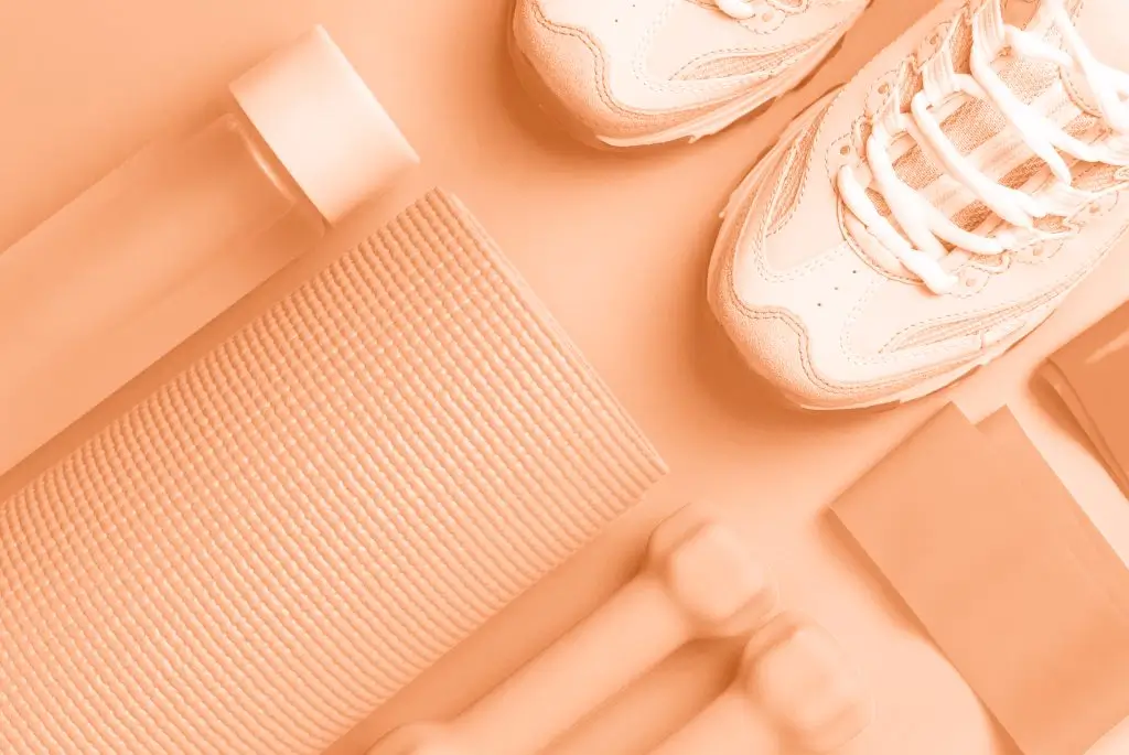
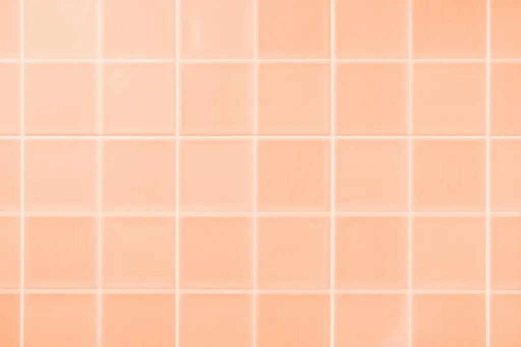
Interior Design influences on Peach Fuzz
Peach Fuzz is a warm, inviting option that adds a touch of coziness and subtle warmth to living areas. The color creates a soft and welcoming atmosphere when it’s used in soft furnishings like curtains and throw pillows or applied to wall colors for living rooms and bedrooms.
It adds a subtle pop of color to accent pieces like artwork or vases without overpowering the overall scheme. This color works well with neutrals like beige and white to create a well-balanced color scheme. Peach fuzz is especially perfect for nurseries and kids’ rooms because of its gentle, calming qualities, which create a relaxing yet playful atmosphere.
This color adds depth and interest to lighting fixtures and textured surfaces like rugs, making the space feel comfortable and visually appealing. The peach fuzz color is ultimately a flexible tool for interior designers, able to create inviting and aesthetically pleasing spaces.
Exterior Design influences on Peach Fuzz
appropriate materials are essential to achieving the Peach Fuzz look; smooth finished wood, textured stucco, and other elements that create an inviting appearance are preferred. Soft and lush vegetation, including warm-toned flowering plants, are featured in thoughtfully chosen landscaping to enhance the overall organic vibe. Rounded edges and minimalistic design elements are used in architectural details to complement this style, creating a warm and refined ambiance. Warm lighting fixtures are purposefully positioned to highlight the cozy characteristics of Peach Fuzz. In conclusion, Peach Fuzz’s influence on exterior design aims to create a peaceful and welcoming outdoor environment by highlighting elegance, simplicity, and a soft, natural feel.
Showcasing properties using Pantone®
In order to improve visual appeal, exhibiting properties with Pantone entails carefully incorporating Pantone colors into many aspects of real estate marketing. In order to create visually striking content that appeals to potential customers, Viewers can customized color schemes in virtual tours and 3D renders thanks to Pantone integration, which gives them a concrete idea of the potential of the property. The use of Pantone colors in professional photography and online listings makes properties stand out in the digital space and draw in online viewers.
To create aesthetically pleasing and cohesive environments, model homes and units can be designed using Pantone colors, providing potential buyers with a tangible and appealing representation. Additionally, by including Pantone colors in customization options, homeowners can add a personal touch to their living areas and match their homes with modern design trends and tastes. All things considered, using Pantone to showcase properties improves the visual narrative of Crown Asia’s real estate offerings and makes the buyer experience memorable and pleasant.
How do real estate pros use Pantone for diverse regional preferences?
By taking into account local market dynamics and cultural quirks, real estate professionals modify Pantone color recommendations to appeal to a wide range of regional preferences. They work with regional designers and conduct demographic analysis to make sure that property presentations reflect the unique preferences of the neighborhood. Customization based on differing buyer preferences is made possible by the flexibility of marketing materials and property staging. Real estate agents can make sure their recommendations are well-received by the diverse demographic landscape by keeping up with localized design trends and having open communication with their clients. This is a calculated move that makes properties more appealing to buyers and suits their aesthetic tastes.
Color Psychology in Designing a Real Estate
To create an atmosphere that stimulates the desired emotional response, certain colors are deliberately chosen. For example, earthy browns and vibrant reds are warm hues that can arouse feelings of warmth and excitement, whereas cool blues and greens can evoke feelings of peace and tranquility. To subconsciously connect with potential buyers, these carefully chosen colors are used in interiors, exteriors, and promotional materials for real estate marketing. The objective is to improve the perceived value of the property, make the experience pleasant and unforgettable, and eventually have an impact on purchasing decisions. Real estate agents can create environments that connect with prospective buyers and support a more visually appealing and emotionally engaging sales strategy by utilizing color psychology.